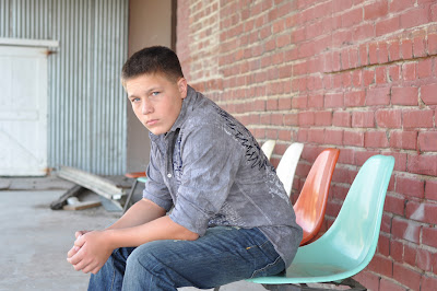
I didn't do much to the photo. Using PSE-8, I adjusted some lighting, contrast, luminance, white balance in the Camera Raw mode. Then, I sharpened the photo and used the CoffeeShop "Color Pop" vignette at a 22% opacity. That's it!
"When you take a great photo, it doesn't need a lot of editing." I've been repeating this to myself lately. If I find that I'm spending too much time editing, I'm usually forcing it and it won't look nice and natural. I toss the photo and try another one.
Before
After


4 comments:
OOO I like it! Though honestly, I think your edit makes his face and the wall behind him look a little bit more orange? I like the redness of the wall in teh background in the original. But I love how you cropped it - it makes him look so much more striking. The composition you gave it gives his presence much more command, and feeling.
This is a neat idea, practicing and being challenged by photographs taken by other people! Nicely done!
I agree, Babyschneider, his face and brick are too orange. Maybe I'll go back and try to fix that...practice practice practice!
Maybe his skin tone is a little off, but I love how you warmed up the photo without making it too bright. :)
you must have fixed whatever they were talking about, I think he looks great!
Post a Comment